The big day is finally here: UAntwerp’s new and improved website goes live on Monday 23 November. Visitors to www.uantwerpen.be will find that the entire website has a fresh new look.
And yet, its content has remained the same… so what’s the difference? Well, the content is now supported by the following three pillars – our ‘holy trinity’:
- a new, future-proof database architecture
- a new web admin tool
- a completely overhauled design.
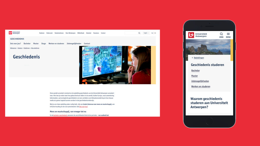
Mobile-first, user-friendly, accessible web design
In 2016, together with Internet Architects, we started the process of optimising our website gradually over the course of several years. We had three main goals:
- make the website ‘mobile first’, as more and more people are visiting our site on their smartphones,
- make the website more accessible to people with disabilities
- make the website more user-friendly, based on user research.
Together with Internet Architects, we opted for the internationally acclaimed ‘top tasks’ approach developed by Customer Carewords. This method enabled us to make decisions based on facts and figures, and to set priorities based on both users’ and our organisation’s top tasks.
In the years that followed, every inch of the website was scrutinised: user surveys, top task analyses, visitor numbers and click behaviour, user tests on top tasks and navigation, an audit by Anysurfer (the label for accessible websites), workshops with our most important editors, and so on.
This resulted in:
- a ranking of top tasks
- a roadmap with all the aspects of the website that needed to be improved,
- an optimised navigation tree
- the first proposals for a redesign.

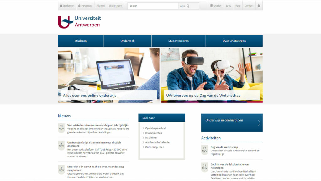
From old … 
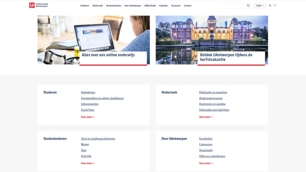
… to new
Future-proof database architecture
The redesign actually required a lot of work behind the scenes. In the current (‘old’) website, everything was intertwined: the layout, templates, content, web admin system, applications that had been added over the years… simply putting a new design on top of this existing web architecture was neither feasible nor desirable.
To move forward, we had to take a step back
E-Campus took on the huge task of reworking everything. Various applications, including online registration, forms and course descriptions, were integrated into other environments as separate ‘islands’.
The heart of the website – all the content – was migrated to a modern, sustainable database architecture, independent of the front end of the website. The database is now a flexible, unified system, providing a solid basis for expanding and refining different elements. And the cherry on top of it all: 130,000 lines of code were reduced to less than 20,000!
Headless and tailless content management system
The university is also switching to a content management system (CMS) that is both headless and tailless. That means that the three entities (the database with all the content, the web admin system and the revamped front end) are kept separate, and communicate with one another through pieces of code.
In the future, this headless and tailless CMS will be able to feed various communication channels, such as student and staff platforms, info screens, an editing environment for brochures, and so on.
Meanwhile, Internet Architects took care of the front end. Based on the existing content elements, a new design was created so that all existing content could flow from the new database to the revamped front end.

The new website has been made completely mobile first, which means we are better able to serve the increasing number of surfers on smartphones.
New web admin tool
Finally, E-Campus also developed a completely overhauled and user-friendly web admin tool. Our hundreds of editors will get to work in a responsive, intuitive and efficient English-language web admin environment.
The editors have had the chance to test this new environment and familiarise themselves with it since 21 September. And since 26 October, they’ve been helping prepare the new website for launch, because once all the content had been migrated there was a lot of cleaning up to do.
Want a sneak peek?
Take a look behind the scenes – but make sure you log in using VPN first!
What about my personal page?
All the information on your personal page has been copied (as most of it’s taken automatically from the personnel database). These personal pages also have a new look. Because of the huge migration process, it won’t be possible to change your photo for a while. However, a workflow is available to customise your intro text or ‘My website’.
Special thanks to…
Internet Architects, our E-Campus colleagues, the communication experts in the Communication Workgroup, all the individual web editors, our working students Zahra, Charlotte and Marieken, and our colleagues in the Communications Department.


